Links to a couple of Ron Bailey's pieces at Reason's Hit and Run blog.
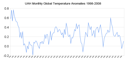
This one is the first hit and run at the Antarctic Warming study. It presents a chart, based on satellite data, showing the trend in global temperatures has been flat over the past decade.

There was a link to the data, suitable for plotting, and I threw together a basic default Excel plot.
Aside from looking like bad abstract art, the main thing I notice is temperatures have risen and fallen over the past three decades. There's no obvious upward or downward trend.
I did pick three data series -- more or less at random, and have Excel draw trend lines, and you can see they show anything from global warming to global cooling.
In a later post, Bailey looks at the claims and counter-claims, including who first came up with the results.

No comments:
Post a Comment